
*Note: All images are screenshots from their respective sites.
The Good
 1. Khan Academy
Streamlined, easy navigation, and awesome organization... Khan Academy is a site with excellent design! I also love that they are a non-profit and promise in their mission statement to remain an ad-free and subscription-free site.

It's beautifully designed and it's resources are all about US History...It just doesn't get any better than that! Although the homepage is a little busy, the graphics and easy navigation make up for it. At first glance I am intrigued by the graphics and want to further explore their resources. In short, this site immediately drew me in.
 3. Digital History
Awesome organization and super easy navigation make this one of my go-to sites for US History! Organized by eras, topics, resources, and references- the site also has an interactive, visual timeline on the homepage for navigation. Pretty cool!
 4. TEDEd
I am a huge fan of TED Talks and TEDEd is just as amazing! Their videos are engaging and their website is impressive. The overall design is appealing and draws the visitor into its vast repertoire of video and lesson resources.
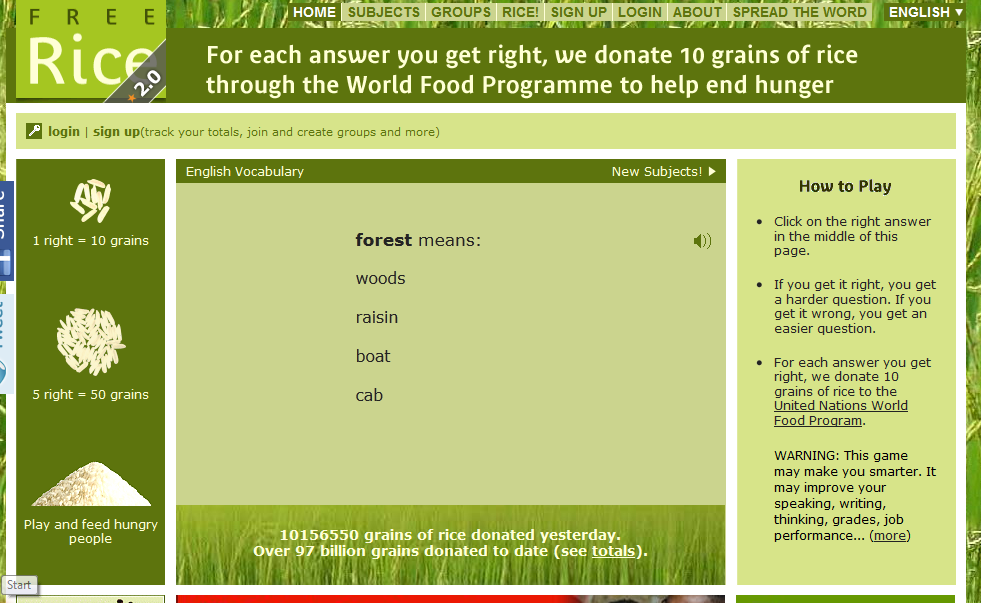 5. Free Rice
I love the design and purpose of this site! Not only is it geared to help educate people around the world, but for every vocabulary word you get right the company will donate 10 grains of rice to the UN's World Food Program. Interactive and engaging, this site gets it right!
The Not-so-Good
 1. Shmoop
While I love shmoop for their amazing study resources, I do not like their platform. It is too busy, overwhelming, and saturated with outside ads.
 2. Hippo Campus
HippoCampus is another site that I love for their resources and easy navigation but the videos are not very exciting. Also, the color and design is too dull and boring for students.
 3. Discovery Education Homework Helper
At first glance, this website has a lot going on. I felt overwhelmed and after digging deeper into the resources was underwhelmed with what they offered students for social studies help.

4. The History Place
This website may have great resources but the colors are too bright and the design is very unprofessional compared to other sites I've seen.
5. Homework Spot

Similar to The History Place, the colors and design are too bright and the site too undeveloped. But the site does offer a ton of resources and links to higher quality websites.
No comments:
Post a Comment